In Room for the River Christchurch artist Shannon Williamson opens a floodgate of subject matter that transcends the boundaries between domestic and creative spaces. Beginning with a drawing project – in which she taped five metres of paper to the walls of her home, so turning her domestic spaces into a living sketchbook – she responds to the rhythms of domesticity against the background of her personal, environmental and aesthetic musings. Room for the River opens 5.30pm Tuesday 4 November 2025 and runs through to 24 November at City Art Depot, 96 Disraeli St. Before her exhibition, Shannon talked to Sally Blundell.

My name, a boning knife, gouache and graphite on paper, 350 x 260mm, 2025
Sally Blundell: Titles often play an important part in your work – how did Room for the River come about?
Shannon Williamson: ‘Room for the river’ is a term used in flood planning, it’s a nature-based strategy that allows rivers to move naturally rather through engineered channels. I heard about it on RNZ and wrote the phrase down in the middle of one of my first wall drawings.
You have used the concept here as a metaphor for your drawing-on-walls project?
Yes. The way I worked I put all these pieces of paper around the walls so I could let everything flood in, making space for concepts I wouldn’t have let into my work so explicitly before. All that peripheral life stuff that forms the fabric of my daily experience, moments that happen while cooking, cleaning, playing with the kids. It was a constant process of gathering and layering. Instead of thinking about my ideas as something I’ll come back to it when I’m in a better space, I realised, this is the space, and this is what making work looks like now. There’s a rawness in making room for the river of ideas.
Is there a vulnerability in that – taking that process out of the private space of the studio?
I definitely had to adjust. I felt almost under surveillance with all that empty paper just waiting for me. But I learned to enjoy the discomfort of having some of my most vulnerable writing and drawing right there on the wall and having others see it. Maybe ‘enjoyed’ isn’t the right word, but it gave me a lot of energy to sit in that discomfort. I learned a lot about myself and had to reflect on how I censor myself.
Was that spontaneity challenging?
At first, yes. I used to need a perfect environment to allow my ideas to flow – so it was confronting to work so chaotically. I have stacks of old notebooks and sketchbooks, and I was looking through them the other day thinking, oh, there are so many cool ideas that I thought I’d come back to and never did. Because they were just notes towards ‘something else’ they have this spontaneous raw immediacy to them, same as these wall drawings have. In retrospect those sketchbook drawings are maybe more interesting than the polished stuff that sees the light of day because of that rawness. It made me realise there isn’t a perfect time for an idea and actually you can lose something in the polishing. You just have to go for it, get it down on paper and let it live, don’t hide it away.
There are also more literal associations with rivers?
Within the early months of this project my father had a rafting accident in the Waiau Toa/Clarence River. He was pinned under water by his paddle and was rescued when a couple of his companions spotted his helmet breaching the surface. After this I began to think more about bodies of water and the stories they know. I wanted to look at sourcing water from local areas to add into my paints but felt I didn’t know how to do this safely, from a cultural, spiritual or biological perspective. This was the impetus for me joining the Pūharakekenui/Styx River water quality monitoring programme, which has influenced some of the language and landscape references that appear in these works. This is all in keeping with my background of immersive research through hands on scientific work, but this time it’s more environmental than medical.
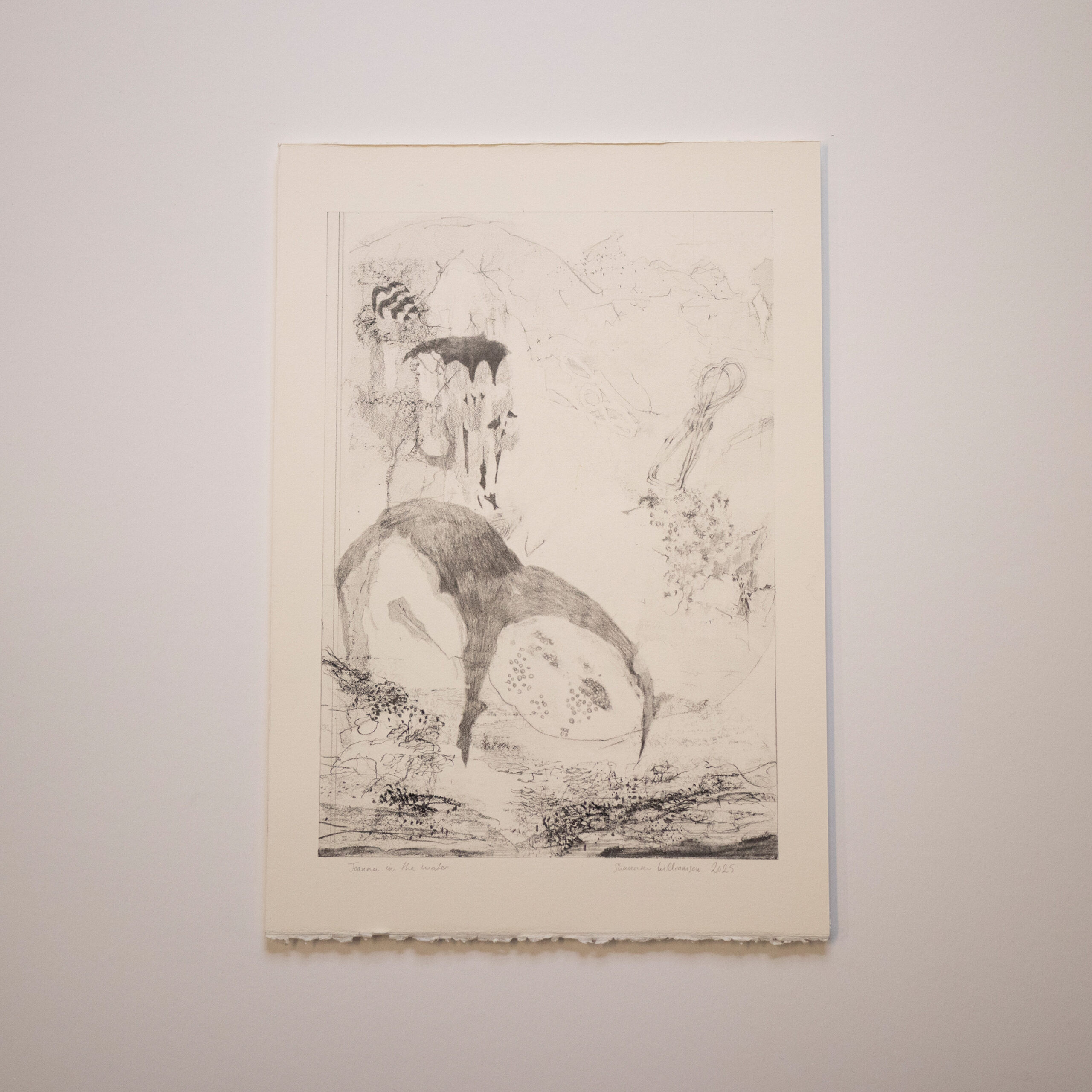
Joanna in the water, graphite on paper, 390 x 270mm, 2025
These is still a lot of anatomical references here – these transcend the boundaries of skin, the external and the internal.
That’s what I love about drawing, you can do away with the boundaries of interior, exterior. It’s a physical working in and out, a layering, where you are actively probing at and taking down those barriers. You can tap straight into the imaginative space working like this. And in doing this I’m often excavating memories I didn’t know I had, these come into the drawings like little ghosts.
How do you negotiate that shift between drawing and painting, graphite and gouache?
Drawing is my primary discipline. I draw all the time and the paintings I do often come from sketches. Years ago I used to paint on top of my drawings, but I got told if I wanted to be a painter, I should cut the cord and get straight into painting, because painting on top of a drawing is a childish way of working. Actually, I think a child’s way of working is pretty great. But I took it to heart and stopped doing it for a long time. Until recently, I would paint over, but never into, my graphite. I tried to keep the two separate. It’s almost a metaphor for this separation of creative and domestic that I’m dealing with now. Here I’m bringing them together again.
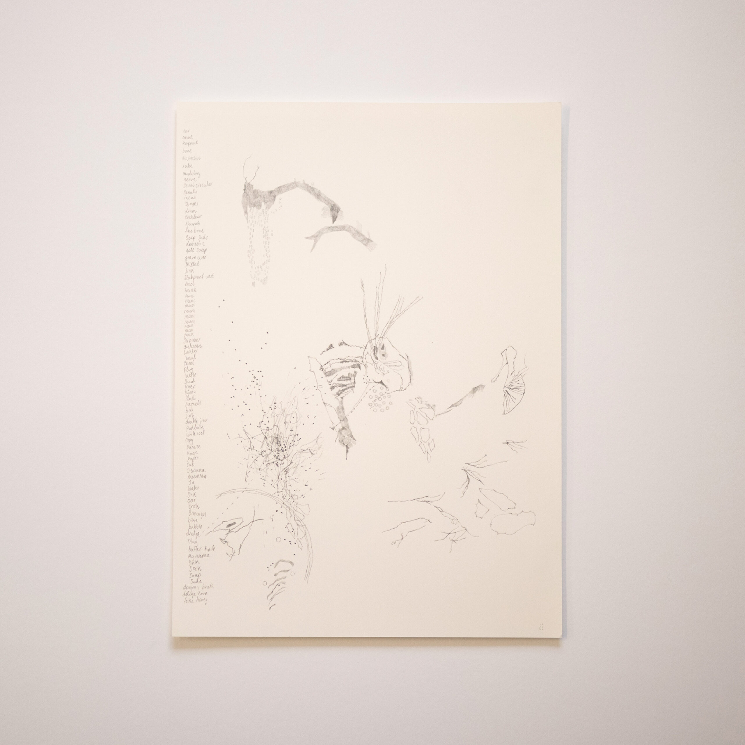
Kitchen inventory ii, graphite on paper, 420 x 300mm, 2025
Do the drawings from your walls underlie all these works?
Yes. Most of these works are the raw drawings that I made on my walls then painted into. I take them down when they’re ‘full’ then literally feel out the energies in them to inform how I’ll paint. By this time there are so many layers that ideas, lines and words meet unintentionally and produce uncanny new realities. This part is really fun. It’s where the work takes off from.
Did this process require a lot of editing – adding and subtracting?
I never erased anything while the work was up on the walls. But because you can’t record everything, I had to hone my method for what made it up on the wall. Anything that gave me a deep emotional response, whether it was delight or sadness or just something I knew, through artistic sensibility, was important. The subtracting and building happened in the studio. It was hard to sacrifice the months of drawings to the painting process, so I traced out a lot of the drawing out first. The unpainted drawings in the show are from this tracing process.
The drawings are almost cartographic, using soft shadowing and barely-there line work.
I like that ephemeral quality, that sense of transience and fragility, like it’s just about to be blown off the page.
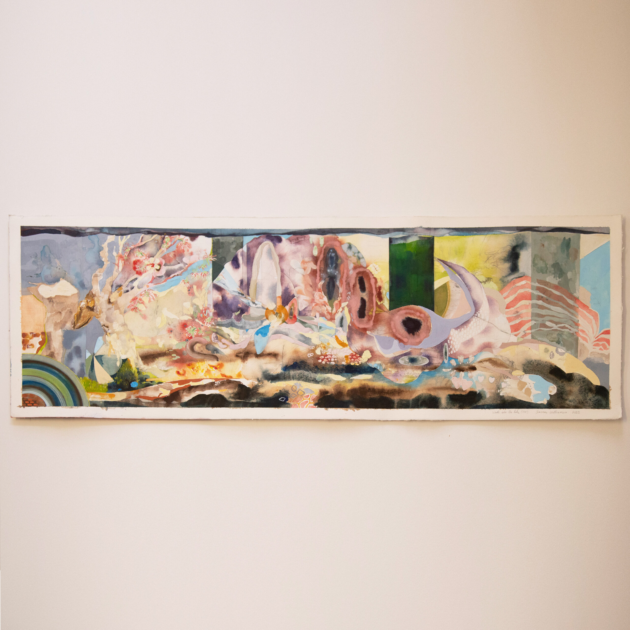
Wade into the lake (TIA), gouache and graphite on paper, 350 x 1000mm, 2025
Some of these drawn words and phrases survive that ‘painting over’ process. In Wade into the lake (TIA) the words ‘interference bowl’ are visible. Where did that come from?
I was playing with the kids outside, mixing coloured dyes in a metal bowl and when the sun hit the metal, it broke up the muddy colour into its primaries, making these beautiful colour patches. I’d just been to a talk by Hamish Coleman, about his ‘interference pigments’ which look different depending on how the light hits them and the phrase ‘interference bowl’ came to mind so I wiped my hands, went inside and wrote it on the drawing in the kitchen. I happened to write it right next to a sketch I’d made of brain segments, drawn in response to the multiple TIAs (transient ischaemic attacks) that my grandmother suffers, which interfere with her memory. I’d annotated this older sketch with the words ‘Kete Aronui’, the basket of human knowledge of aroha and peace. The serendipitous merging of language – of the bowl and the basket, alongside themes of interference – became the reason I rendered that area with so much anatomical colour and shape later on.
You’ve spent time working in sleep laboratories with EEGs and the like as well as a lot of time in dissection labs. Are these scientific understandings reflected in your choice of colours?
A lot of the colours are influenced by my experience in the UWA dissection lab (Perth) and also with plastinated and dry specimens from the University of Otago’s WD Trotter Museum. This dry blood kind of colour, this purpley brown – they’re all specimen colours. And then my synaesthesia comes in as I respond emotionally to the drawings I’m painting on, like in the more vibrant blues.
Those more vibrant colours also appear in flower-like forms, even rainbows.
The flowers in Wade into the lake (TIA) reference pōhutukawa flowers being placed into water, a symbol of mourning and remembrance in Māori culture. I was in my kitchen listening to the news coverage of the Whakaari memorial where they talked about this. I drew it while I listened, imagining the grief and the flowers sinking. The rainbows in my work are often aesthetic devices but they also provide me a bit of a break from all the heavy emotional stuff I bring into my work. They feel hopeful and reminiscent of childhood.
Where did the title stab proof vest come from?
Around the end of last year there was a lot of conversation in the news around supplying people who work in the community with stab proof vests, specifically paramedics. It feels like such a contradiction that the people who serve the community the most are at such risk of violence. There’s something incredibly jarring about how casually society’s violence is summarised then itemised for news headlines. A Perspex box; a sock comes from the same line of thought, there was discussion in the media about increasing those screens with little holes in them, placed between customers and staff so you can hear but not hurt each other. The sock, from A sock down her throat, is an example of how you can also hear violence. The phrase is taken from (Australian broadcaster) Alan Jones’s comment that Jacinda Ardern should ‘have a sock shoved down her throat’. It was included in a list of news stories, along with the need to increase Perspex screens. I thought, here we are talking about stab proof vests and Perspex boxes, yet we give so much airtime to public figures with these hugely aggressive, offhand comments.
But you don’t paint the horror of these things?
I think if you go too dark you can miss communicating the point. For me, the point here was to examine themes of care, threat and protection. How the objects we design, with care in mind, can speak about the state of society, yet a simple sock can become a weapon. I hope to communicate a bit more delicacy and wonder than horror.
Wade into the lake (resomate) has that same combination of delicacy and wonder, even though resomation is a very physical, visceral process in itself.
Resomation is a new process for decomposing bodies using water instead of fire. What is left behind are bones, hip and dental implants and amino acid. This list of parts was read out on the radio while I made the kids lunch one day. I thought it was a lovely catalogue of materials, a story of what goes back into the land and what we leave behind.
Both these works include ‘wade into the lake’ in the title – why is this important?
That phrase became a mantra for me. While making these works, life things would happen and I would feel crushed and I’d say to myself, just wade into the lake. Yeah, it’s cold and it’s horrible and it stings, and then you stand there and let all that discomfort soak in until you acclimatise, then you wade a little bit deeper and eventually you’re swimming. I wrote it down on multiple drawings as a reminder when I was struggling: just to wade into the lake, trust your process.
Even when it is tempting to turn around and run for the shore?
Yeah. I think everything in life that matters is like that, isn’t it? That’s why it’s wading, not swimming, not jumping, it’s just slowly moving in.
City Art Depot warmly welcomes everyone to attend an artist talk by Shannon Williamson 1pm Thursday 6th November at City Art Depot.