Lyttelton-based artist Scott Jackson’s practice falls into a triangular space formed by pop culture (from pre-historic through to contemporary), speculative fiction and the psychology around the sub-conscious and dream worlds. Pulling inspiration from book plates and tarot cards, Scott Jackson presents SLOWCHOCK; a dreamlike body of works that oscillate between feverish and prophetic. SLOWCHOCK runs 7–28 October 2025. Ahead of this Jackson spoke to City Art Reader editor Cameron Ralston about his show.
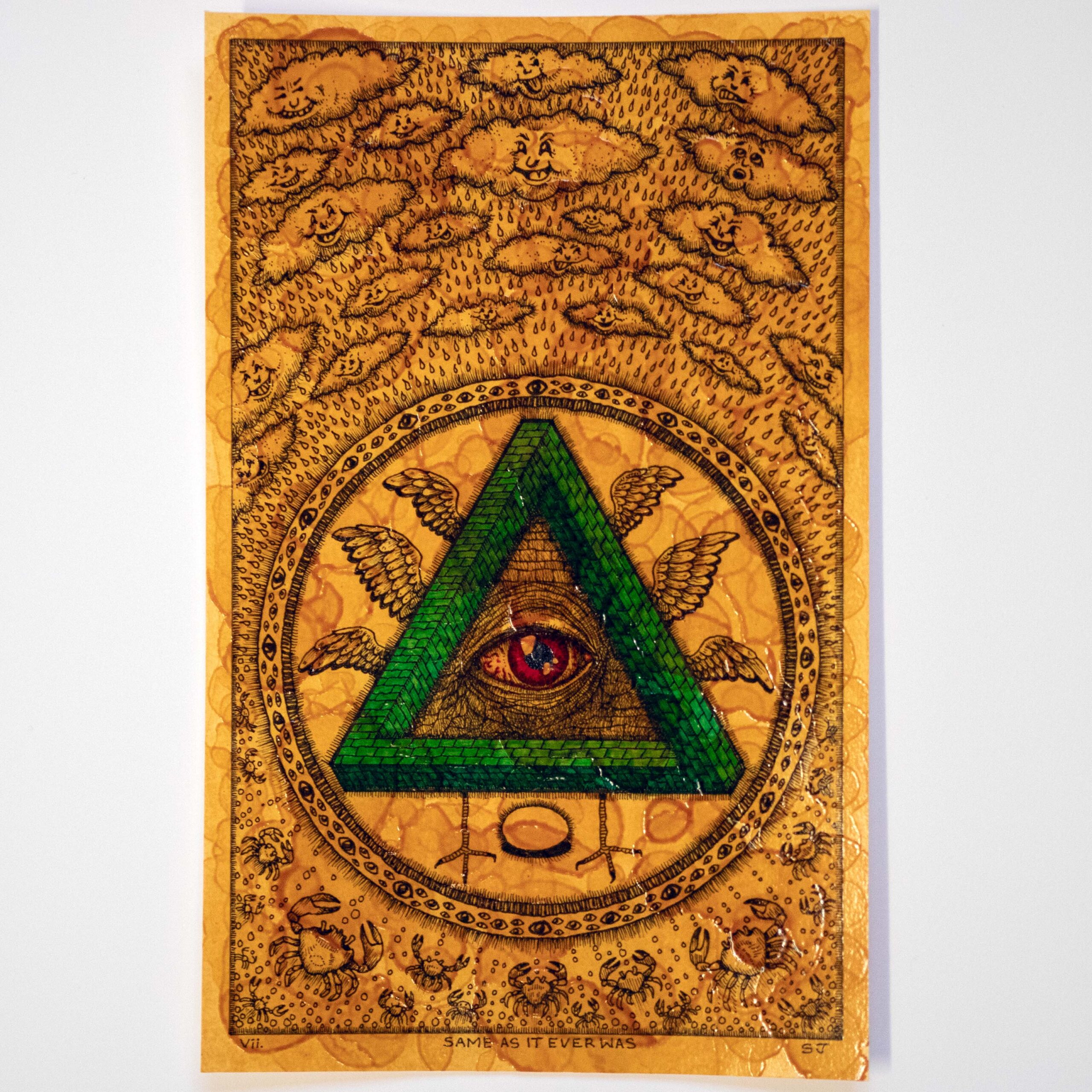
vii. Same as it ever was, ink and shellac on paper, 250x160mm, 2025
Cameron Ralston: Looking for a meaning in your art is pretty elusive. Are these images and references bubbling up from your subconscious somewhere? In the past you’ve likened these to strange ingredients jammed together in a sandwich. Is this still the case? Do you keep track of that or are they striking you at the time of making?
Scott Jackson: It wells up from the subconscious initially. Sometimes it strikes me while I’m making the work. Or I’ll be doing something else during the day, and out of the blue I’ll get a really strong mental image of something I know I’ll include. Sometimes I’ll wake up from a dream that leaves a feeling or impression that I’ll then try to convey. The ‘sandwiching’ is the result of the mix of inspirations maybe? Trying to find meaning in it all would be difficult – I struggle to myself half the time although occasionally I understand later. I think the meaning is in there. . . somewhere?
Your work seems to poke fun at some of the darker, ill parts of society. What draws you to that kind of levity?
Honestly, I’m not sure. The world seems in a dire psychological state at the moment, but maybe it always has been. We’re watching the same 12 big companies switch the narrative from ‘The environment is fine’ to ‘It’s too late to change anything, you people should have recycled more’. I probably fall into the ‘Y’ gotta laugh or you’ll cry’ school.
There’s an intensity to the busy line work, patterned elements and thick coats of shellac. The paper is almost flooded with marks. Are you using these to turn the volume up in these artworks?
Yes. I’ve noticed that the drawings are very dense this time around, albeit a bit smaller. The shellac I love because, to me anyway, it makes the drawings into more of a solid object, it makes them a bit harder to read – peering through a darkened window of varnish. The coating being an insect-derived material adds a strangeness to it all. Like honey or leather, it’s not suitable for some vegans!
What was the motivation behind the book plate-esque borders and titles on these artworks?
Exactly. Old book plates, also tarot cards. I found I was enjoying that aesthetic. On another level I wanted to give myself some very definite size restrictions.
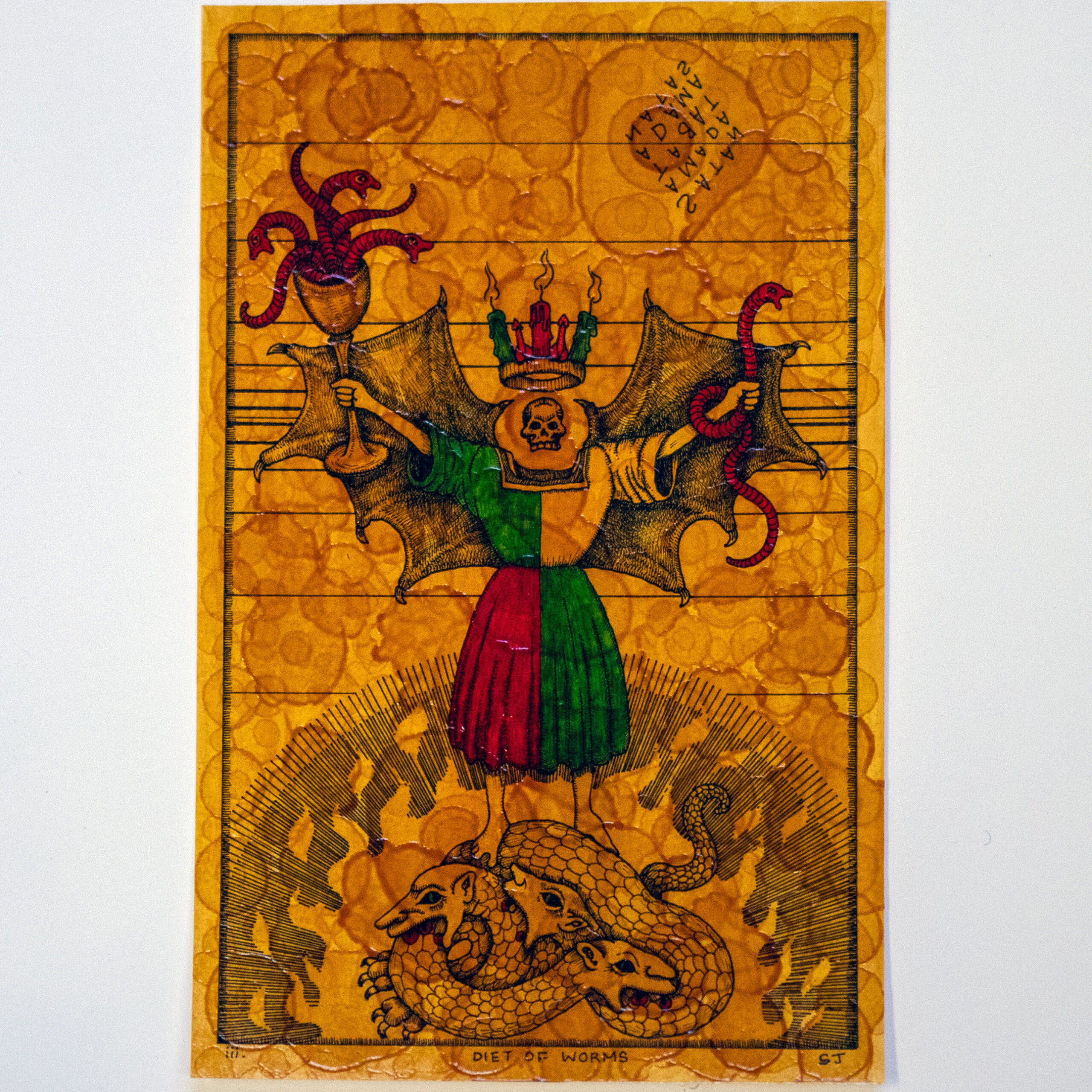
iii. Diet of Worms, ink and shellac on paper, 250x160mm, 2025
It’s like you’ve smashed together a dream-like medieval aesthetic with doodled cartoons from the margins of a notebook. You strike balance in the looseness but obviously considered drawing, and in the content of the works – such as your reference to the 1521 Diet of Worms (a fairly obscure academic thing to know about these days) but depicting a winged figure with goblets of actual snake-like worms. How do you see those balancing contrasts in your work?
Yeah, I don’t really hold much distinction at how old the imagery is, anything from prehistoric art to modern design seems like fair game. They don’t feel jarring to me – more like complementary contrasts. Any references to historic events aren’t necessarily significant. Or maybe they are? We’re definitely doomed to repeat history I suppose.
For those of us who aren’t witches or into the occult, horror media is where we might typically encounter such presentations of symbols, creatures and macabre. I suppose because they present the unknown. But those things typically are signifiers for something. For example, an ouroboros and scarab both can represent the eternal cycle of birth, death and rebirth, and an eye in a triangle can represent the all seeing eye of God. Are you interested in these meanings? Are such ideas expressed through art an area of curiosity or study for you?
Haha, for the few of us who aren’t witches or into the occult… Yes, I am interested in the meanings but I like looking at symbols I don’t understand, too. I’m not a religious person, but I feel that things have an unexplainability that means, whether or not it’s a function of humanity, that the world has an aspect we call wairua or spirit. I don’t think, for most people, that you can 100% escape that, simply by being an atheist. I’ve drawn symbols for as long as I can remember – if you believe in them then they can have power or convey meaning. Just like words can, if you believe them. Find the clues, solve the riddles – it’s like Gnosticism doodled in the margins.
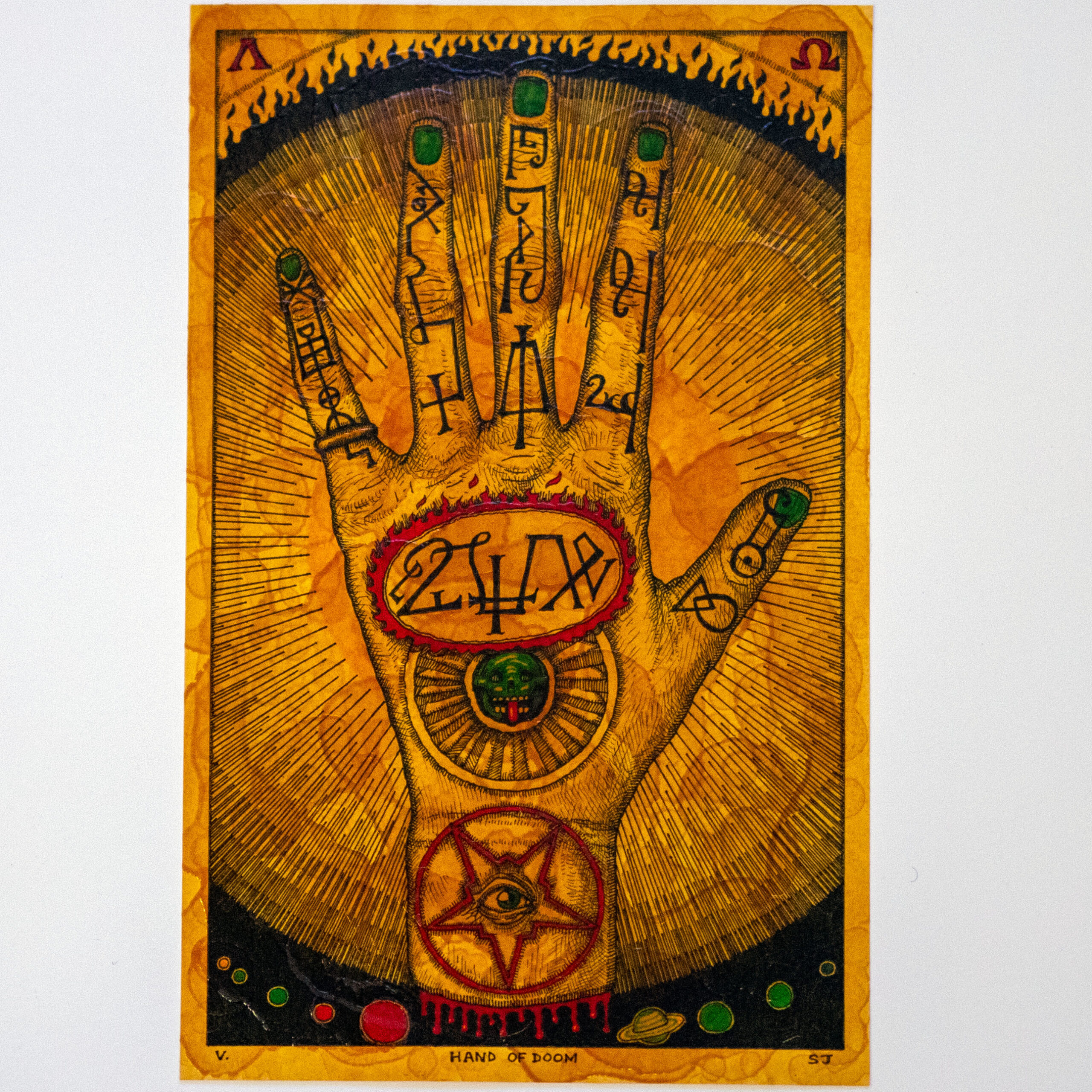
v. Hand of Doom, ink and shellac on paper, 250x160mm, 2025
Your works seem to reference music as well, with Talking Heads song lyric ‘Same as it ever was’, Black Sabbath song title ‘Hand of Doom’, and even real life events – Port Noise 2025 for which you made the poster artwork. What influence does music have on your artwork?
Music is definitely my favourite artform, and I listen to it a lot while I draw. I don’t think twice about using musical references in the art, it can directly inspire a mood that gets into the work or just add another bit of flavour to the mix.
How did you land on the title for the exhibition, SLOWCHOCK?
My friend at work and I cooked it up years ago as a mythical band name – think we were chocking a door? Was it Aldous Huxley who said ‘the doors of perception must be opened’? I can’t remember, but anyhoo, if we did, I think we’ve been slow to chock them open.